A book for plants

GROW


A little book for plants, printed on waterproof paper, to encourage them to reach their full potential. I originally had thoughts of a library of stories for plants at different stages of their lives, but once I came up with this punny picture book, I was pretty much done.
The construction took a few goes to get right and I’m not one hundred percent convinced I went about it the right way, but sometimes the perfect is the enemy of the good. (I feel like I use some variation of this whenever I write about something I make - please forgive the repetition.) Given that the books need to stand up to watering, I didn’t want there to be any plastic used in the construction. I’m not 100% happy about the use of a heavy duty staple, but I refer to my earlier perfect-good point. Trying to get something that was aesthetically pleasing from the outside and also functional for the reader proved a bit annoying. In the end, I used a sort of fake-case binding, with a ‘spine’ covering the lolly stick and staple. The interior is just one sheet and you need to crease it a bit if you want your plant to read the first or last pages, but I’m quite pleased with how these came out.
If you’d like some, they’re available in my shop.
Jules Feiffer
Cartoonist and scriptwriter Jules Feiffer died. I had his book “The Great Comic Book Heroes” when I was younger, firstly appreciating the reprinted golden age comics that were so primitively drawn I thought even I could replicate them. When I was a bit older, I read the long foreword and afterwords, where Feiffer recalls his introduction to comic books, both as a reader and a creator. What came across so strongly was the excitement of those early days, the thought that they were on the vanguard of a new medium that would change the world. There were arguments about the egos of Superman and Batman fans and whether it was necessary to draw every button on a shirt. Feiffer recalls breaking into the industry as a protege to comics great Will Eisner, doing fill-in work on Eisner’s Sunday strip, The Spirit.
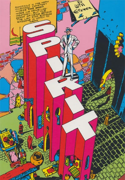
There’s an episode of The Spirit in The Great Comic Book Heroes that I devoured over and over again when I was a kid and it made me hungry for more Spirit stories. When I finally found some in a comics shop, it was difficult to ignore the racially stereotyped depiction of Ebony White, who hadn’t been featured in the Feiffer book. (Also, the Spirit wears a white suit in that story, which is how I think of him.) Eisner has said that the character wasn’t intended to be racist, but poking fun and Jim Crow era caricatures. That may be true, but it never sat right with me as a reader. I’m not one for airbrushing out past prejudice in historical material - I think it’s important in understanding societal attitudes - but there are choices to be made as a consumer.
Anyway, Feiffer’s work in the Village Voice shows that he was a great cartoonist beyond his work for Eisner. This LitHub article gives a good overview of his varied career.
And there’s a good precis by Shawn Gilmore of The Great Comic Books Heroes, including scanned pages, at Vault of Culture.
David Lynch
Obviously, the other significant artist to pass away recently was David Lynch. There’s been a lot written about his films in the past few weeks, but not much about his music. Lynch wrote and recorded several albums, often mixing weird electronic sounds with a kind of Rockabilly, Americana rhythm section. I know that sounds awful and sometimes it is, but it’s interesting seeing someone who’s a master of one form kind of flail around in another.
Have a listen.
‘Crazy Clown Time’ by David Lynch on Apple Music
The Institute for Unreadable Typography
Atypography is a movement that makes things more difficult to read and oooooh I don’t know how I feel about it. On the one hand, there’s a playfulness to its approach that I enjoy. On the other, I feel there’s enough bloody obtuseness in graphic design already. These abstract letterforms look like the sort of thing you see in the background of Playstation 2 games. I had a colleague who loved this sort of thing and it drove me crazy. I think I have to accept that I’m someone who likes obscure things to made clearer, not the other way around.
But have a look at the video and if it tickles you, there’s a whole manifesto at: www.atypography.com.
Ongoing Notebook Obsession
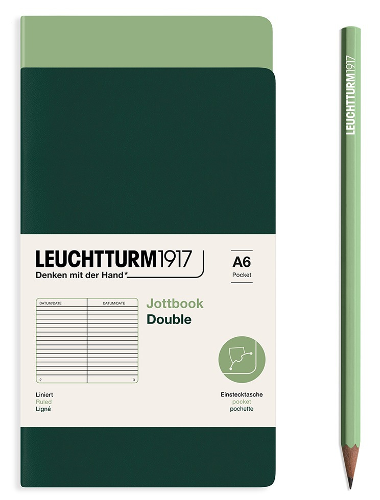
It’s back! After a spell of just going with Moleskines, I branched out again and am trying out Leuchtturm Jottbooks. These are are an alternative to Moleskine Cahiers, which are cardboard-covered 60 page notebooks that encourage more of a casual kind of use. The Jottbooks have a laminated cardstock for the cover, though, and feel a bit more sturdy than the Cahiers. They come in packs of two and have some of the features that make Luchtturm feel just a bit nicer, like page numbers, an index page and little sticky labels for filing. Whether niceness is a pro or a con depends on you. I’m becoming increasingly of the opinion that cheap notebooks are better for you, but whatever. These are OK. I suspect the key difference is the paper. The Moleskine pages seem to be getting more see through and I know that many people prefer Leuchtturms. These Jottbooks aren’t the easiest to get, though, and there’s not much about them online. I picked up a few two-packs at Postmark in Victoria Station. They’re maybe £10–12 for two, which sounds stupid now that I write it. I bought them, though, so I have to use them.
(They come also come in A5 size, but that doesn’t fit in my back pocket.)
Available direct from the manufacturer.
Some things I liked
Triangle of Sadness
I’d been told that this was good, but that sometimes puts you off, doesn’t it? Particularly when you see that a something’s won a big prize (in this case the Palme D’Or). But this is worth watching! It’s in turns funny and awful and gross and insightful. It runs through issues of economics and privilige, right from an awkward conversation about who gets the bill at dinner to a class inversion on a luxury cruise. It’s quite something.
Triangle of Sadness is on iPlayer and other streaming services.
The Truth About The Harry Quebert Affair by Joël Dicker
This isn’t a recommendation - the book went on for far too long and seemed weirdly unbothered by the title character having an an affair with a fifteen year old - but there was one little nugget in there that I actually highlighted in my Kindle edition:
Don’t write to be read. Write to be heard.
Samurai Backpack by Murase Kabanko
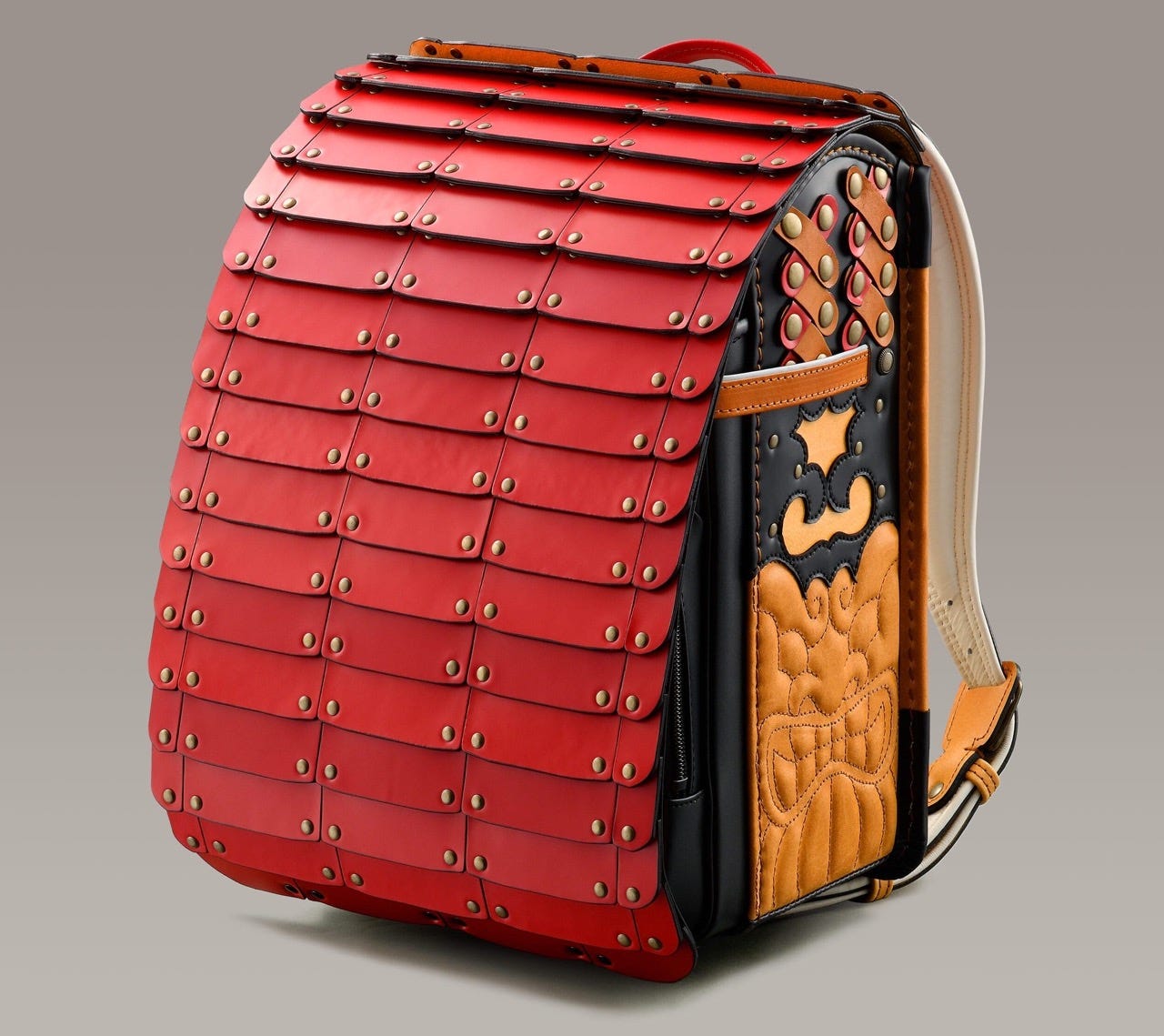
The detailing isn’t quite my thing, but those slatted… things… curling over the flap on the back. Mwah.
https://www.thisiscolossal.com/2024/11/samuri-inspired-randoseru/
The Hardest Working Font in Manhattan
This illustrated essay by Marcin Wichary about the monoline typeface Gorton is extensive and well worth a look, if that’s your sort of thing.
https://aresluna.org/the-hardest-working-font-in-manhattan/
I think that’s it. I hope you’re keeping well. Nourish yourself and get in touch with the people you care about.
ta